Latest Article
Why Your Downstrokes Are Too Thin: A Flex Nib Primer
Feb 24 · 8 min read
4,200 letterersare already in the circle.
"The Art of Beautiful Writing, One Stroke at a Time."
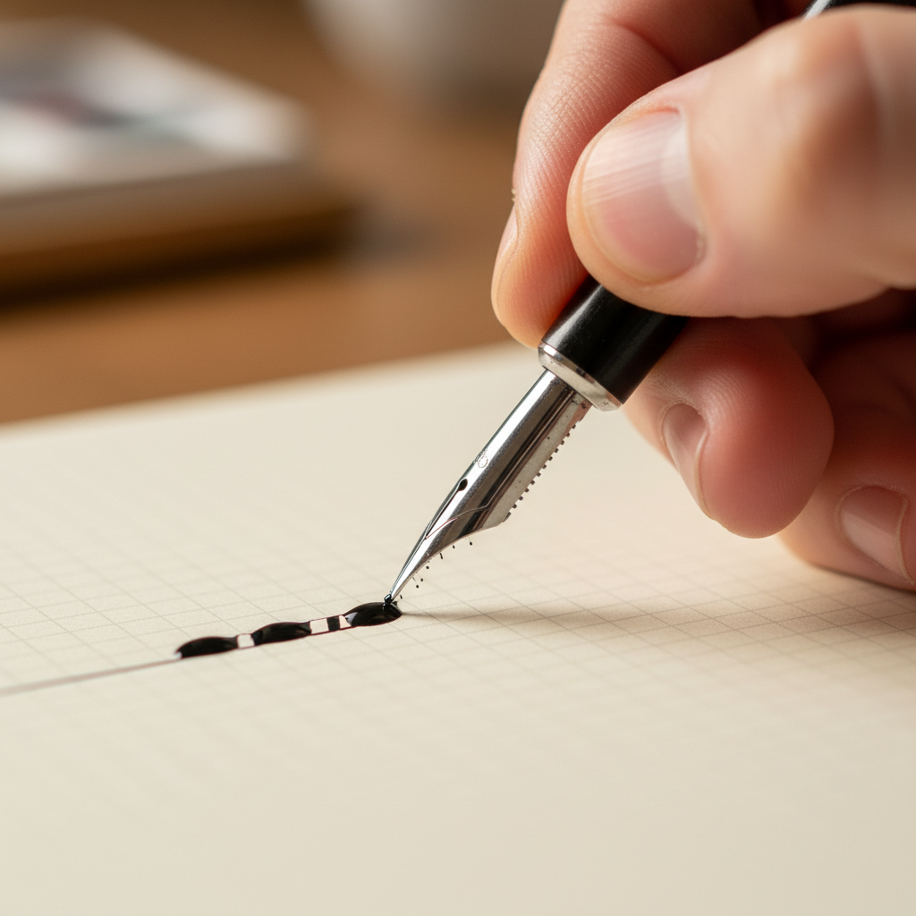
Iron Gall on Rhodia — a Wednesday morning practice
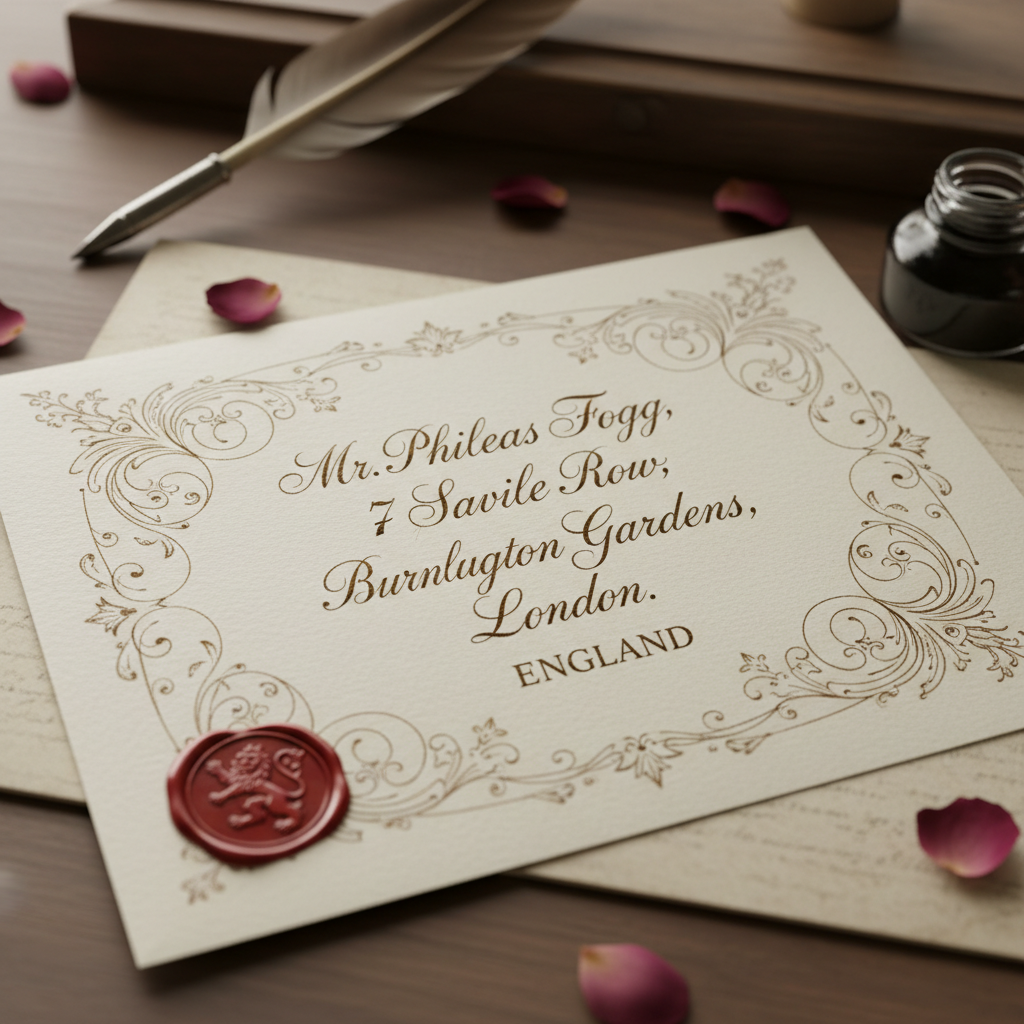
For everyone who has ever been moved by a hand-addressed envelope.
Flourish is where ink meets intention — a community for calligraphers at every stage of the journey.
This Issue
Latest Article
Feb 24 · 8 min read
Tutorial
Feb 20 · 12 min read
Community
Feb 18 · 5 min read
WorkshopLive
14 seats remaining
Deep Dive
Feb 12 · 15 min read
"Join 4,200 letterers who open our weekly dispatch."
Join the Letter Circle4,200+
Members
120+
Tutorials
38
Workshops
Origin Story
The Beginning
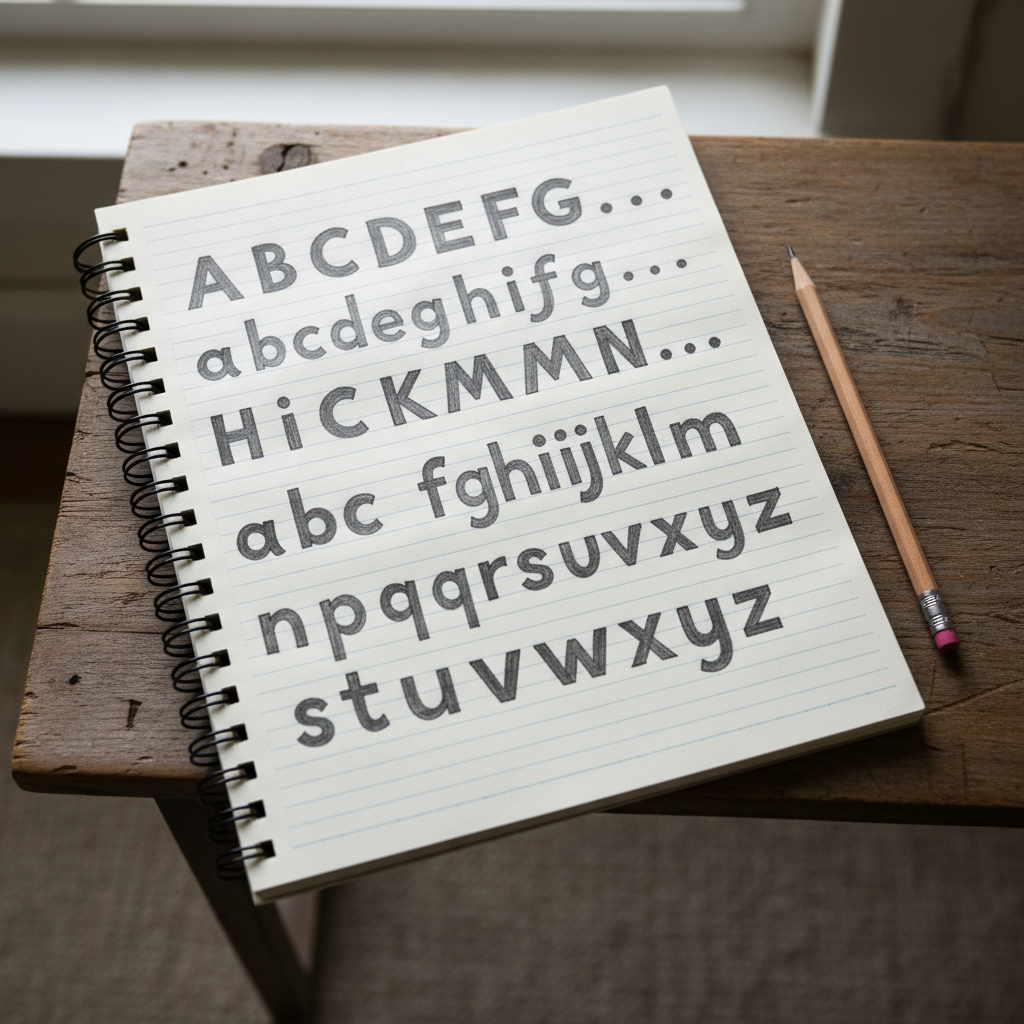
It started with a Staedtler felt-tip and a YouTube video I watched at 2 a.m. I was printing the alphabet in block capitals, frustrated that my letters looked like a ransom note. I didn't know what a nib was. I didn't know what "x-height" meant. I just knew that the letters I was seeing on wedding invitations made something ache in my chest — and I wanted to make something that beautiful.
The Discovery
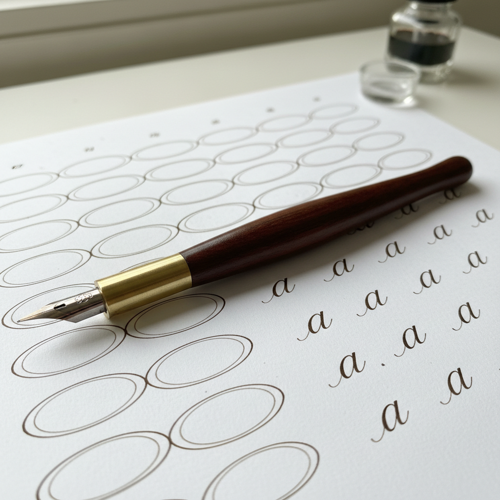
A calligrapher at a craft market handed me an oblique holder loaded with a Nikko G nib. I pressed it to paper. The flex opened. The thick downstroke appeared. I looked up at her and said, "I have to learn this." She said, "Everyone says that." She was right. I spent the next eight months filling practice sheets every morning before work — Copperplate ovals, entry strokes, the letter "a" three hundred times.
"The flex opened. The thick downstroke appeared. I looked up and said: I have to learn this."
The Commission
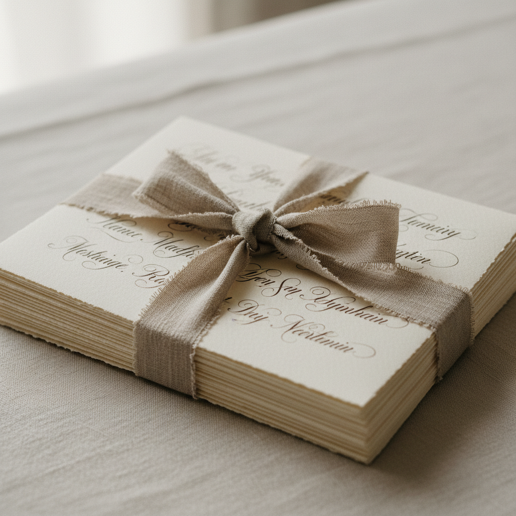
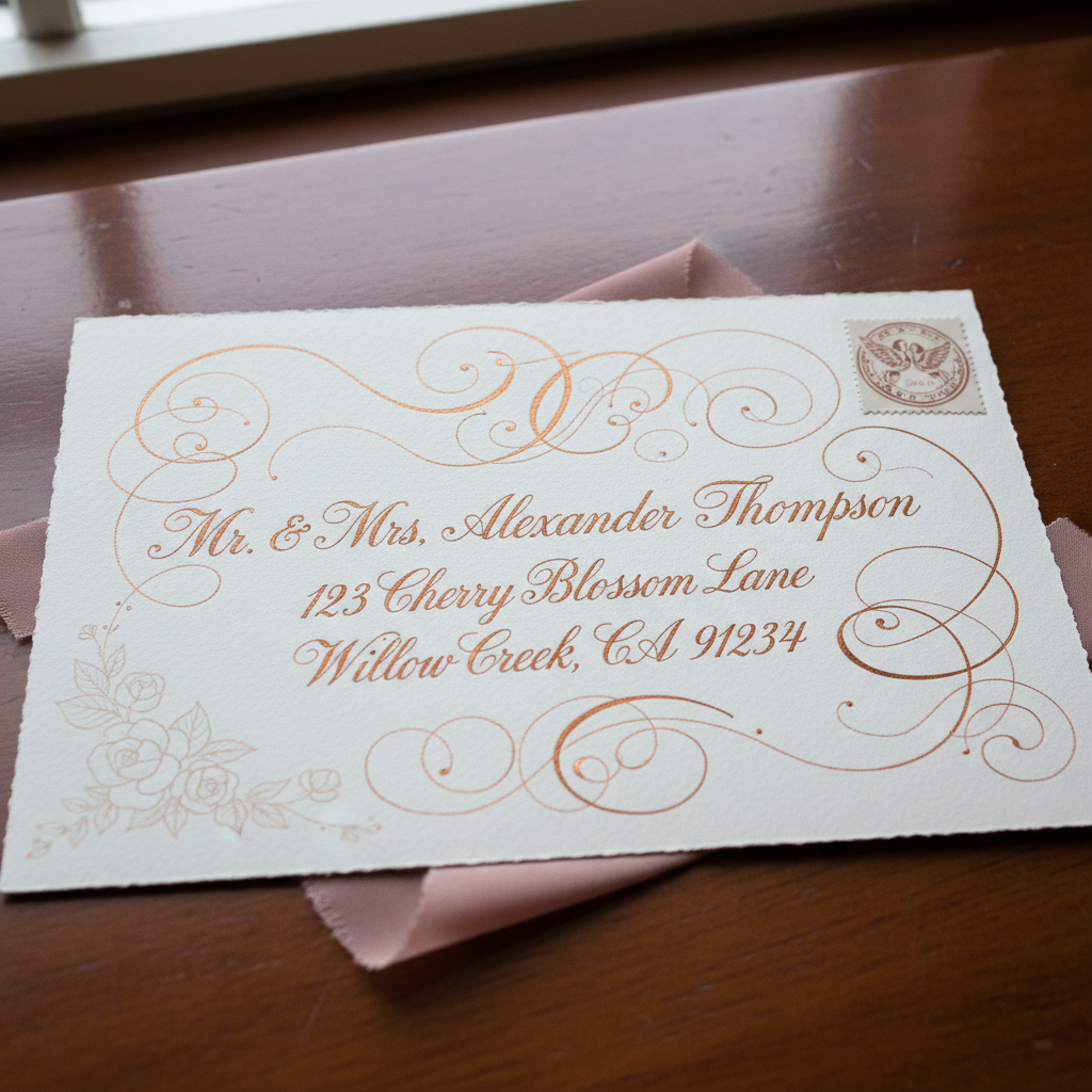
A friend of a friend asked if I could address 200 envelopes for her wedding. I said yes before I calculated how long it would take. Forty hours. Twelve ink refills. One wrist brace. When the bride opened the box and went quiet for a full ten seconds, I understood why calligraphers do this. It wasn't the money. It was the weight of that silence — the recognition that someone's most important day would carry a small piece of something I made by hand.
The Turn
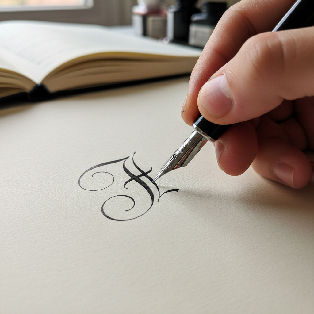
I was teaching a Saturday workshop when Amara — a graphic designer who'd been practicing for six months — produced a Spencerian capital "F" so perfectly looped that the room went silent. She looked at me, embarrassed. I told her the truth: "That's better than mine." That was the moment I stopped thinking of myself as a teacher and started thinking of myself as a steward. This community wasn't mine to lead. It was ours to build.
"That's better than mine." — The moment I stopped leading and started stewarding.
"I learned alone. You don't have to."
Flourish exists because the best calligraphy communities I wished for didn't exist when I needed them. That changes here.
Community Transformations
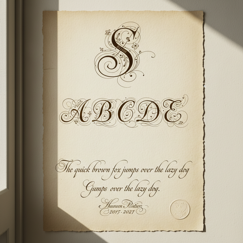
From first brush pen to first paid commission — every member arrives at a different point on the path. These are three of theirs.
Amara Osei
Graphic Designer → Wedding Calligrapher
"The community feedback loop changed everything. I went from "is this okay?" to "this is my craft.""
Priya Nair
Hobbyist → First Commission at 6 Months
"I priced my first commission using the calculator in the resources section. Charged what I was worth."
Daniel Ferreira
Type Designer Discovering Historical Scripts
"Understanding why Spencerian works made me a better type designer. The history is inseparable from the form."
4,200+
Active Members
78%
Improve in 90 Days
340+
Wedding Commissions Booked
12
Countries Represented
The Letter Circle
Every week: a new tutorial, a community challenge, and honest conversation about the craft. No algorithms. Just ink and intention, delivered to your inbox.
Free Download
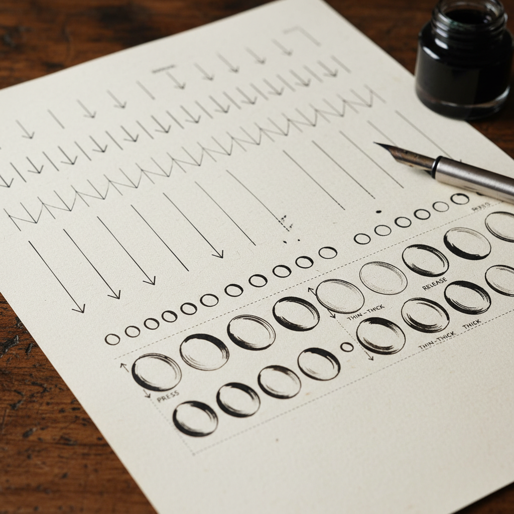
The same 12-page practice sheet I used every morning for two years — basic strokes, pressure exercises, oval drills, and the five letterforms beginners always get wrong. Yours tonight, free.
Email only. No purchase, no commitment. Just ink on paper tonight.
Flourish
12 pages · Pointed nib · Free
For the beginner who is serious.
Downloaded 2,800+ times
4.9 average rating